Narrative and systems
We live in a nostalgic era where trends are everything, the 70s, 80s, 90s… we miss these times. It seems as if we did not wanted to be in the present anymore, where everything became systematic and cold.
In a conference on design systems in UI/UX, Wences Sans gave as an example the first websites such as the SpaceJam site (a masterpiece that is still online), where he shared the feeling of discovering something new while exploring, a feeling as if the internet was a completely unknown world compared to our actual relationship towards it, where we seem to have seen it all. This led to some questions like “when did web sites stopped being this way?” specifically talking about how design systems and “layouts” took over to simplify design structures.
While working on branding, sooner or later, you start developing systems where everything responds to the same single function, aesthetic parameters and structure, as if it was a mathematical formula, it is then when you realize that this equation has a complete lack of narrative. I’m talking about the narrative that these old web sites had or the experience of unpacking a product, or even launching an app had. These processes tell a story, a story that has a beginning and an end, processes that take over emotions and achieve in making you excited. Design systems are wonderful and necessary for a good design as they help to shape the final product, but at the same time they become predictable and impersonal.
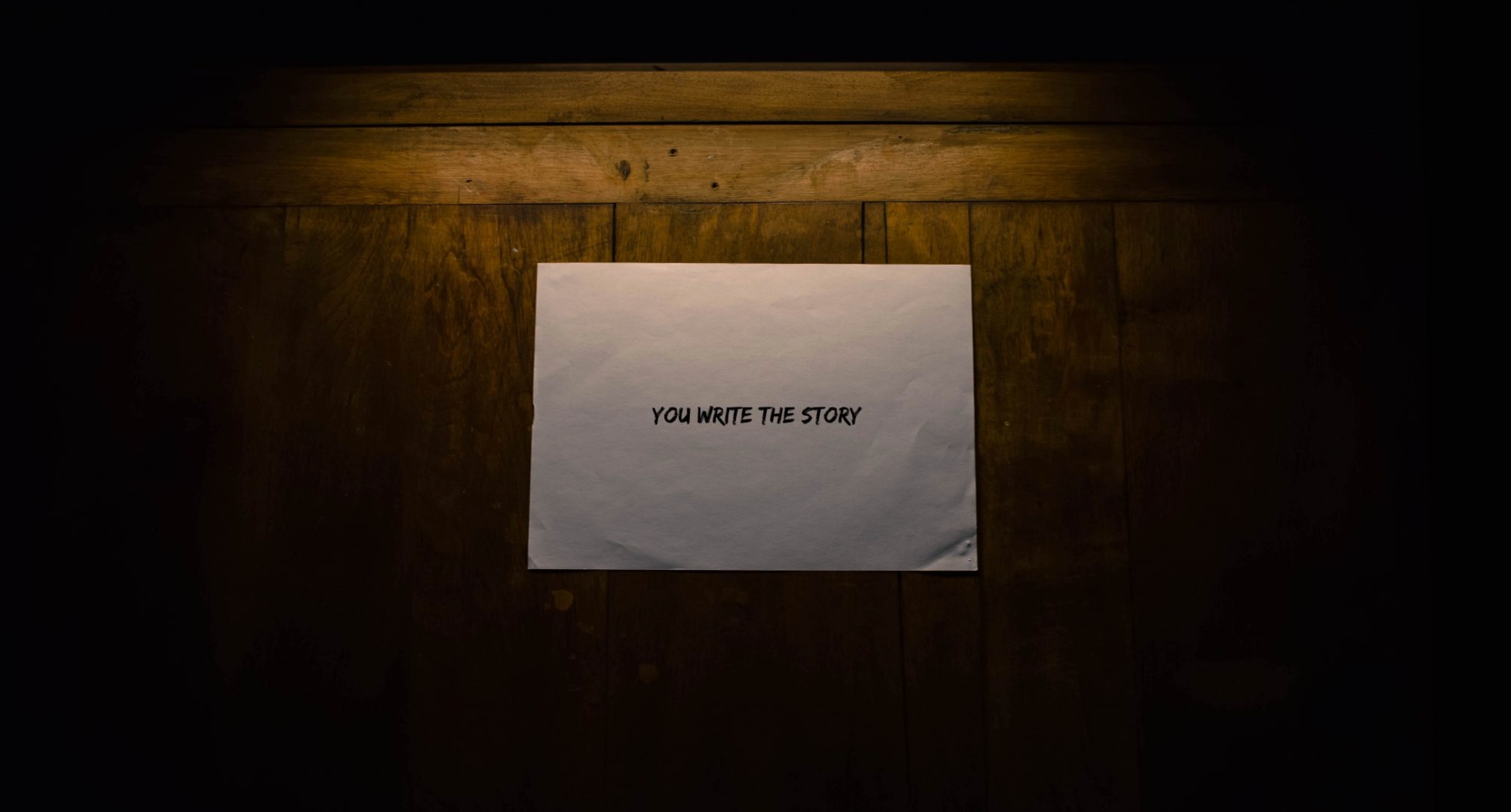
This is an invitation to think about design from another perspective, one that evokes feelings. Let’s excite the observer, let’s think about timeless results, let’s leave aside trends and predictable design pieces but mainly, let’s keep telling stories and bringing the surprise factor back into our lives. (Thanks to Javier Cañada for his worldview and perspective).


