


Get Color Inspired
Matisse once said that his choice of color is not based on scientific theory but more on observation, feelings, and experiences.
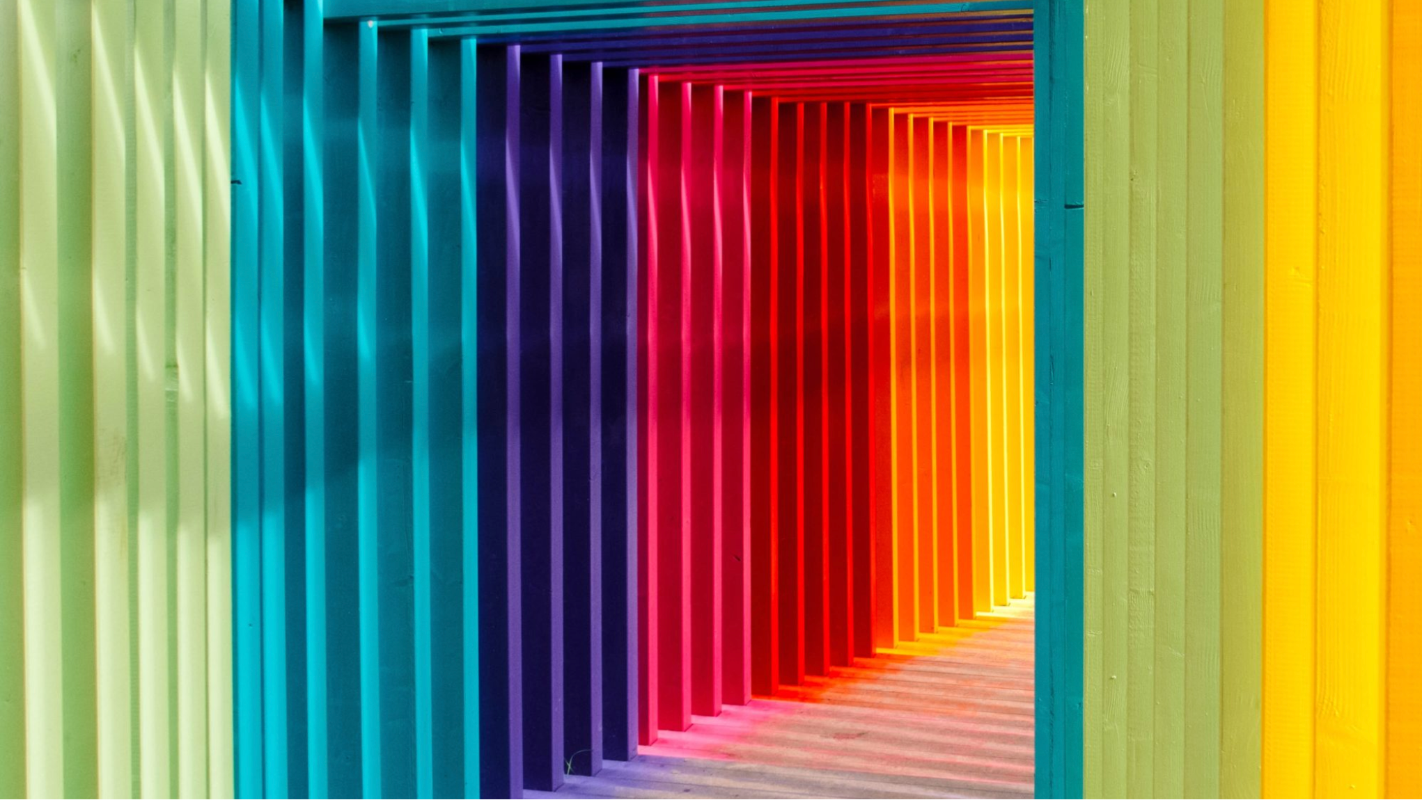
Color is one of the important factors within art and design. It can change perceptions and moods. Sometimes, it can be hard to find the right balance of hues to accomplish a harmonious color palette. So, how can you create one?
There are several ways to achieve this. It is, of course helpful, to know the basics of color theory, meanings, primary and secondary colors, triadic combinations, etc. Betty Edwards’ Color Book is a great starting point if you’re new to color theory, but for those times when you’re stuck and you’re not sure which hues to select, I will share some tools, tips, and books that have helped me get through.
Personally, color is an important ingredient in my daily life, not only design-wise but within my environment as well. It gets me inspired, not to mention that I’m a massive fan of color coordination. It has been something very present in my life. Since I was a child my family immersed me in colors especially my mother, who is always using vibrant ones, but also cities (like Campeche, Mexico), nature, cultures, including food.
Birds and flowers have a natural way of combining colors. There is no better reference of color combination than nature (perhaps Adobe Color). No joke, when in doubt delve into nature or Patrick Baty’s book “Nature’s Palette” which is an enriched color catalog of the natural world with color swatches.
I’m always amazed by how the same color can look different depending on the size or in contrast with another color. Although there is no “wrong” color combination, how hues vibrate together can affect the eye and make it uncomfortable to look at sometimes. The Interaction of Color by Josef Albers is a great teaching book that encourages you to experiment with color and play with your surroundings. Plus it has an iPad App (but check its compatibility first).
It’s pretty obvious to mention Pantone but here it is anyway. It’s helpful to stay updated with what Pantone is doing. So even subscribing to their newsletter can help you get a sense of color trends and palettes.
It’s helpful and inspiring to look at color masters like Henri Matisse, David Hockney, and Frida Kahlo. If you rather get references from a design perspective, check out Victionary Palette books, they showcase a wide variety of color projects. There are currently five editions, Black & White, Multicolour, Gold & Silver, Neon, and Pastel.
It’s important to mention that color has a historical and cultural association, and it is helpful to keep that in mind when designing. The Story of Colour by Gavin Evans and The Designer’s Dictionary of Color by Sean Adams are great starting points regarding this matter.
As designers we need to keep in mind the effect color can have on people because it is subjective and emotional, we can also have different reactions to it based on our experiences.
Matisse once said that his choice of color is not based on scientific theory but more on observation, feelings, and experiences. These experiences can also extend to Grapheme-color synesthesia or listening to it like Neil Harbisson. Personally, I think there are many options to explore hues and combinations, you just need to be open to experiment with them.